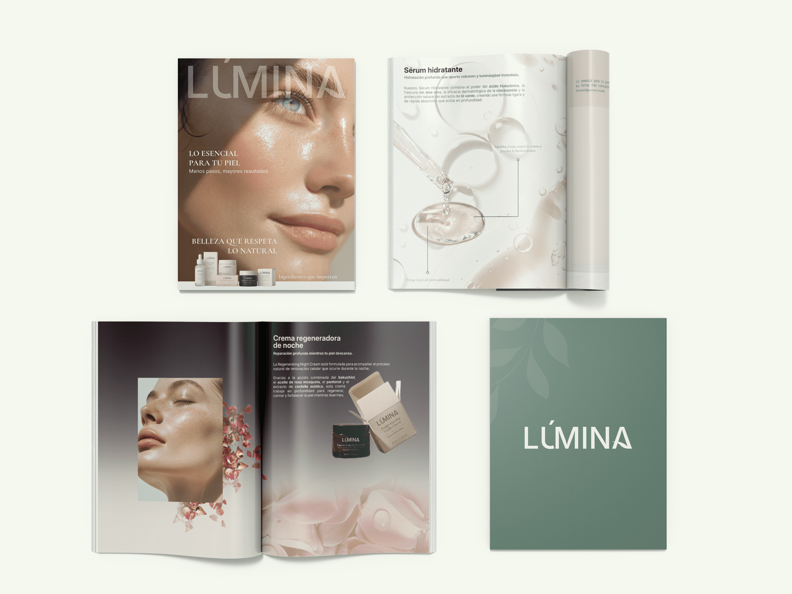
In a world where personal care has become complex and filled with exaggerated promises, LÚMINA is born from a place of calm.
We believe that caring for your skin should be a simple, mindful, and pleasurable moment. That’s why we bring together dermatological science and local botanicals to create formulas that are effective, clean, and responsible toward the planet.
We speak with clarity, act with transparency, and design every detail to return to what truly matters: simple routines, visible results, and a more honest relationship with your skin.
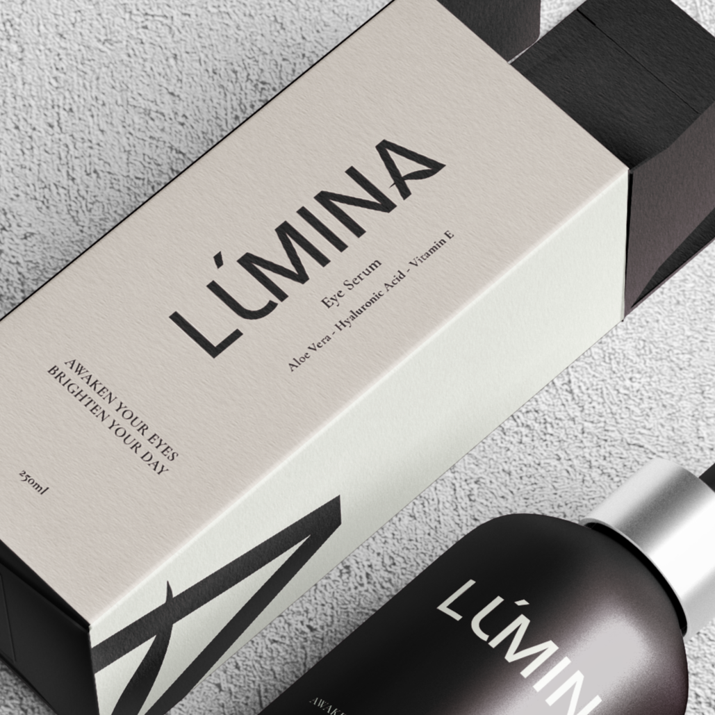
LÚMINA.The essentials for your skin.
LIGHT ISN’T APPLIED, IT’S AWAKENED
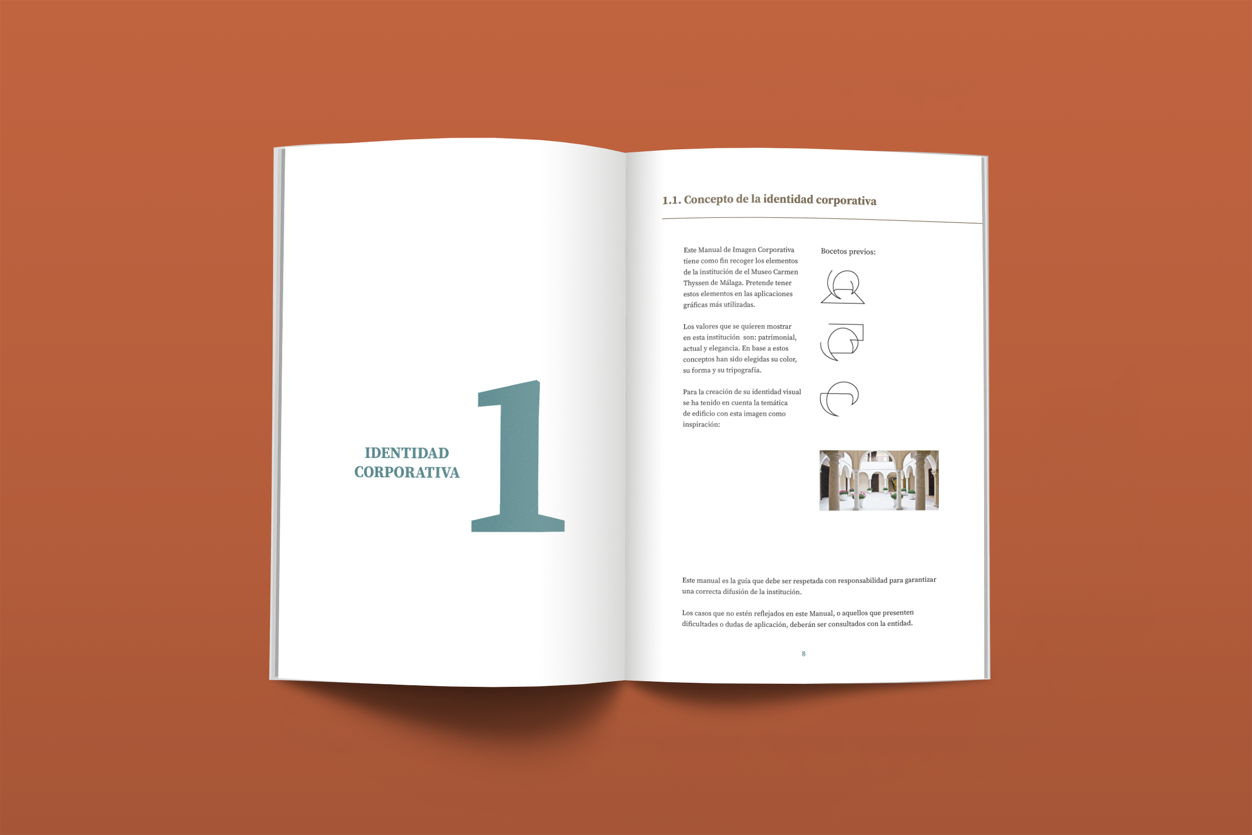
It is a personal project in which the brand LÚMINA is born as a conscious facial care proposal, focused on restoring simplicity within the world of skincare. It emerges as a response to a market saturated with exaggerated promises and complex routines, embracing a philosophy rooted in calm, transparency, and real effectiveness.
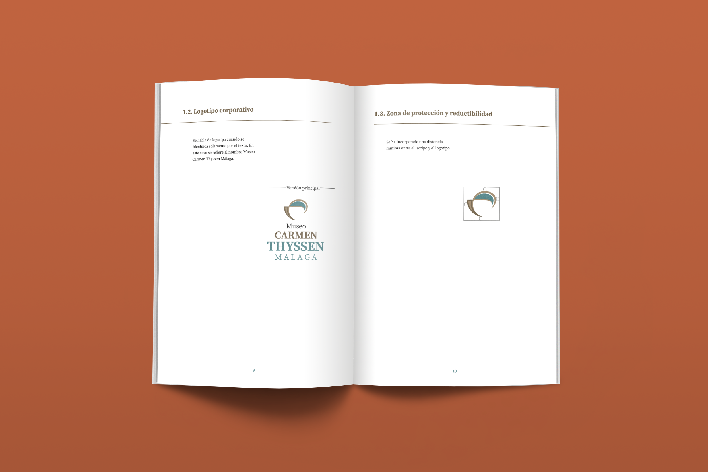
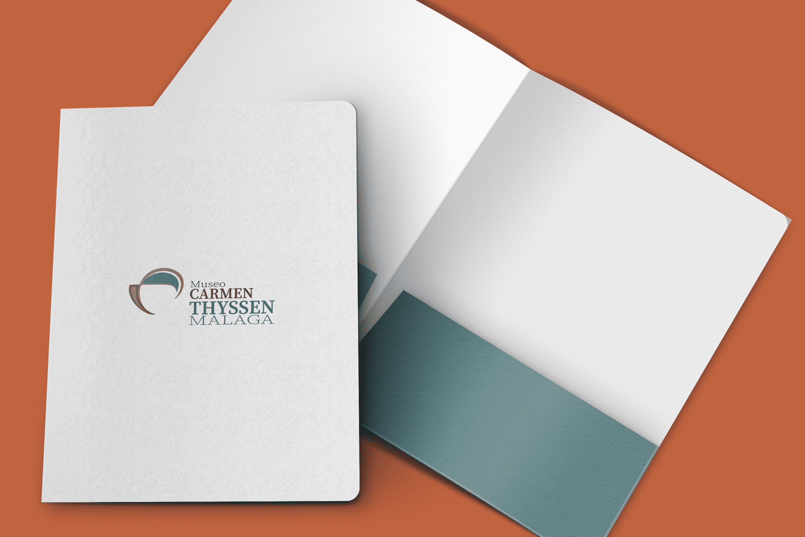
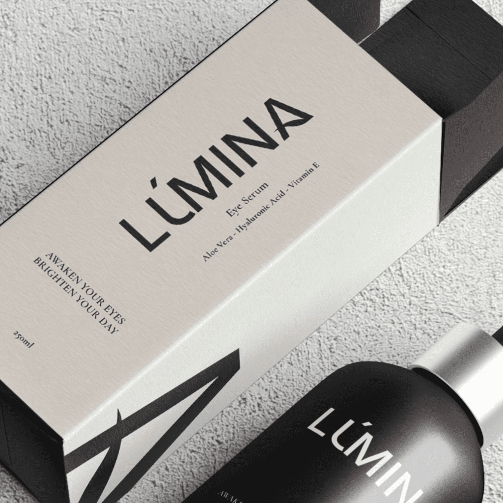
MAIN LOGO
LÚMINA’s logo is the brand’s most direct visual expression. It represents clarity, balance, and modernity through a clean, contemporary typeface with a serene character.
Its typographic construction conveys minimalism, confidence, and luminosity, reinforcing the essence of the brand: returning to what truly matters.
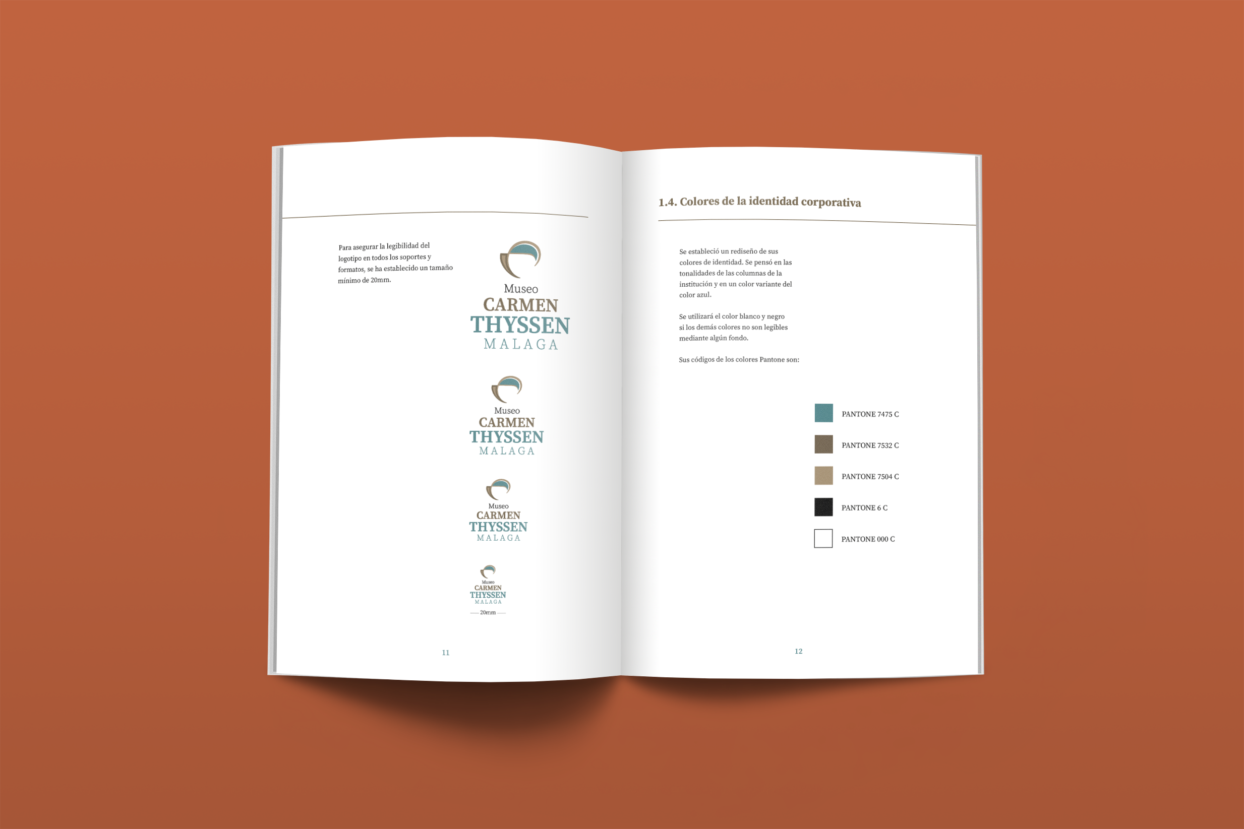
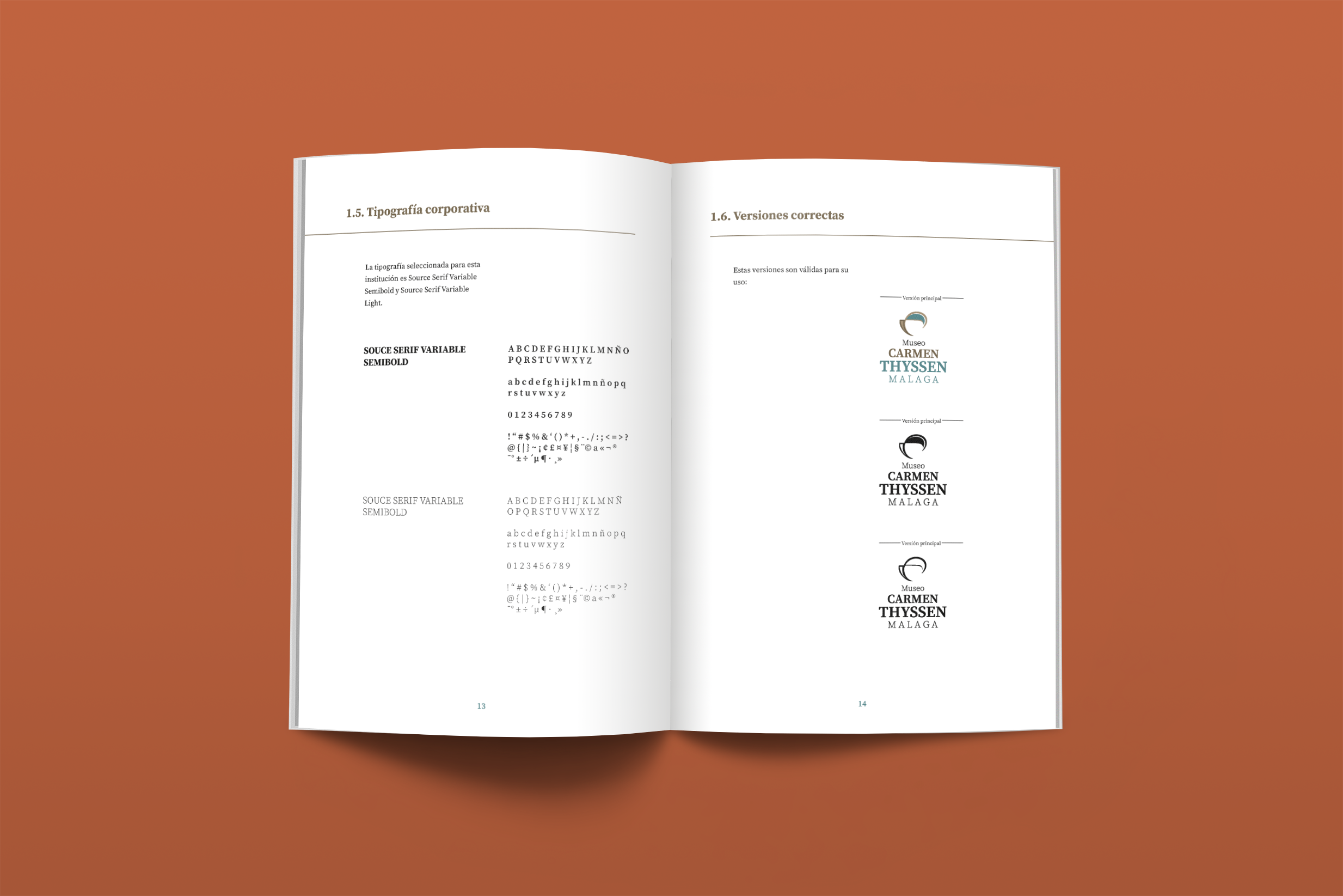
Logo variations
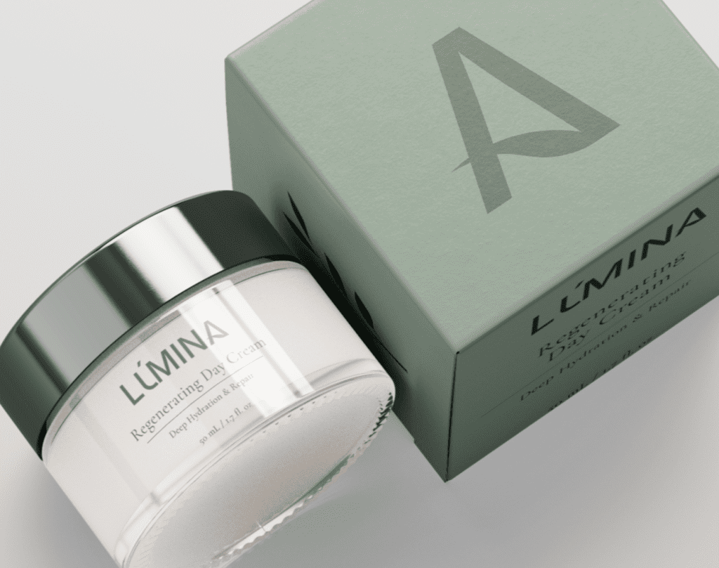
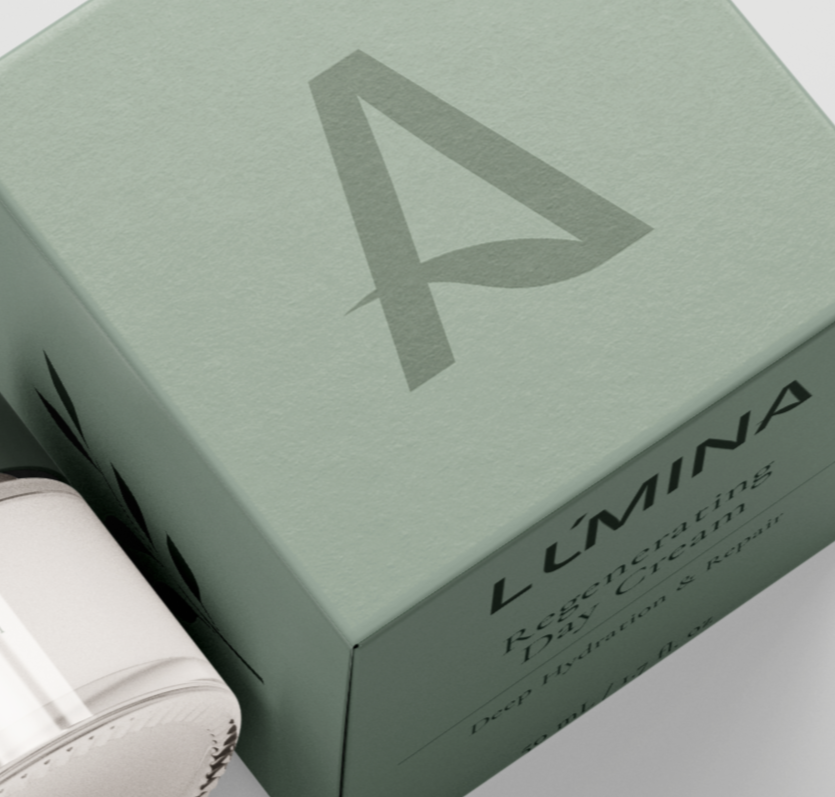
MAIN ICON
The symbol emerges from the intervention of the letter “A” in the logotype, integrating into its structure an organic shape that evokes a leaf. It is an element that is easily adaptable to packaging, labels, and social media, maintaining visual coherence and reinforcing LÚMINA’s serene and contemporary identity.
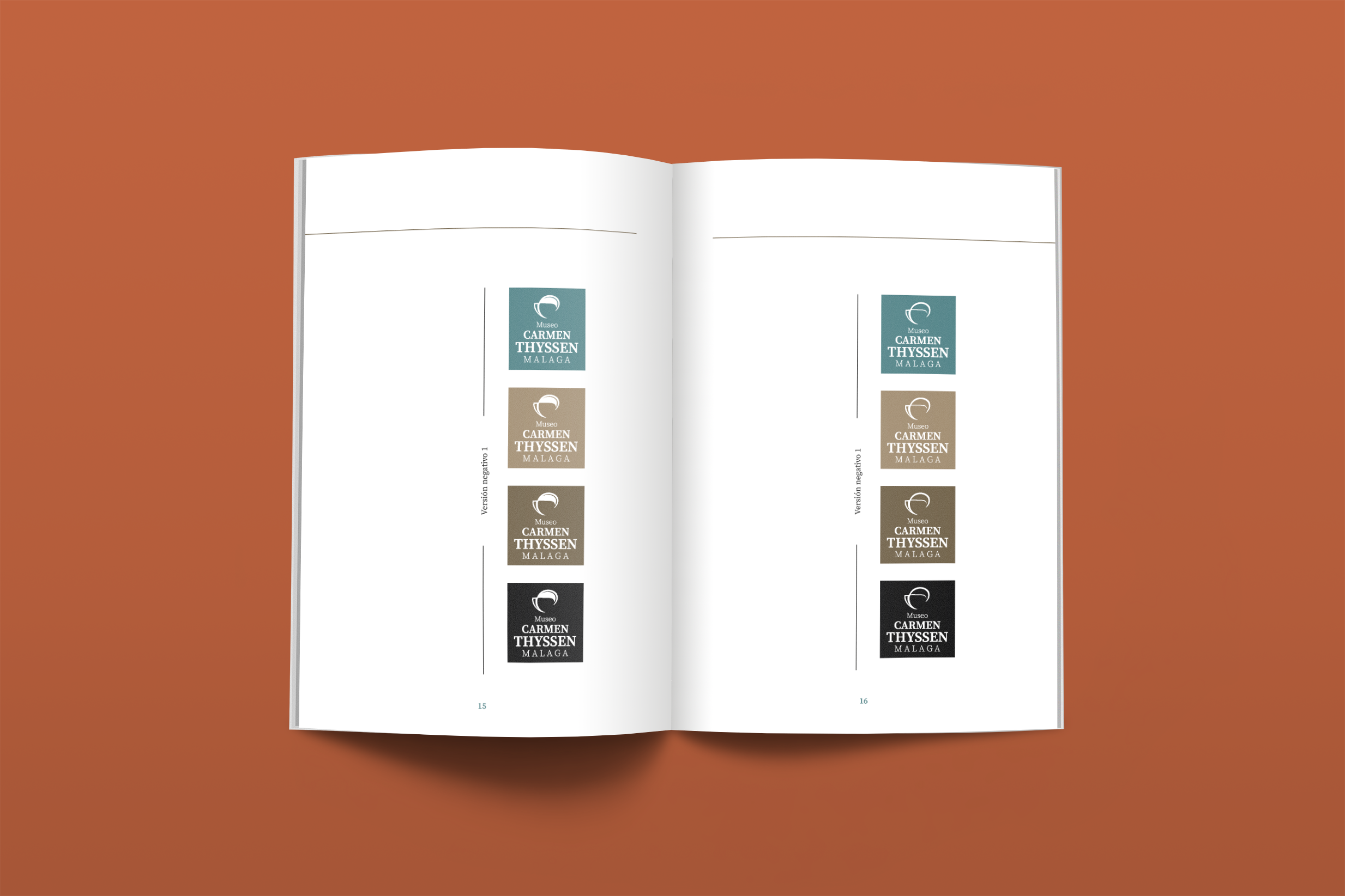
Icon variations


ANATOMY

#5F6F66
#F5F6EE
#E6DDD4
#1F0812

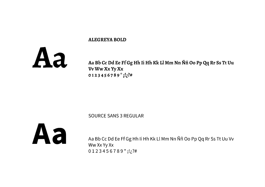
TYPOGRAPHY
The primary typeface, Inter, is a fundamental pillar of LÚMINA’s visual identity. It is characterized by a clean and contemporary design, which reinforces the brand’s clarity and honesty. Its clean, geometric structure communicates professionalism and stability, strengthening its foundation through the union of nature and scientific formulation.